
|
Great customer experience strategies must inevitably be formed around good data. Even for smaller organizations that might not have the data quantity or research resources to perform statistically sound analyses, the importance of good data, even if only anecdotal, cannot be overstated.
I am not a professional researcher, so I will just say that in my opinion good consumer data must be accurate, timely, and relevant. It should also address a question whose answer can lead to a tangible business result.
Any training on consumer research should include these items and more; however, if you are a receiver of data, there is another dynamic you should be aware of and that is perspective — both your own and that of those who produced the data.
Let’s use a few simple graphics to illustrate power of perspective when evaluating data.
Which annual performance below is the most volatile and which is the most steady?
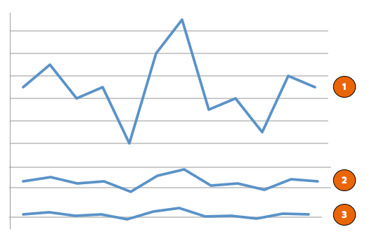
Most likely, you answered that #1 is the most volatile and #3 is the most steady. Or, since the beginning of this post probably set your antenna off to a trick, you might have answered that there is really no way to know without the scale markings to designate the range.
The answer actually is none of the above. None of the data sets are more volatile than the other, because all three lines represent the same data.
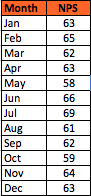
To create these graphs, we used a sample data set of annual Net Promoter® Scores. If you are not familiar with NPS®, the Wikipedia page here will give you a good overview.
To give you a benchmark on how to view these scores, top NPS scores are in the 65%-80% range (NPS is expressed as a percentage). USAA scored an 80% in 2013; Southwest Airlines scored a 66%. On the low side, the industry average NPS for TV service providers was 2% in 2013.
Below is the sample data we used, representing a year of monthly NPS scores:
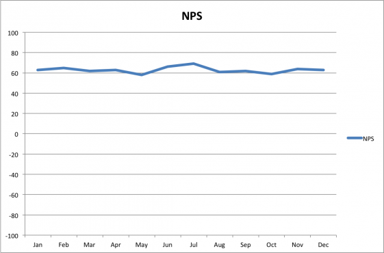
Let’s look at the first line chart above, isolated from the other two. In this case, we used the default scale chosen by Excel when creating the chart.
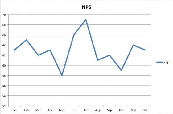
As you can see, this company’s NPS score has varied wildly over the past year.
Or has it?
What if we simply changed the scale of the graph? After all, NPS is not measured between 52% and 70%. The TV service provider industry has a 2% average. Let’s try a 0 to 100% scale.
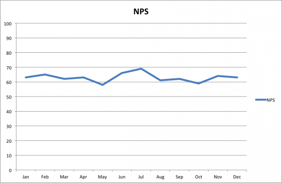
This changes the perspective completely. How inconsistent does the performance seem now?
Now, let’s take it one step further. Technically, the most accurate scale would encompass the full potential range of NPS. NPS can actually be negative — and it often is. The full range of NPS would be -100% to 100%, which results in the following chart:
Obviously, this graph shows a wholly different perspective of the company’s annual NPS performance compared to the first graph
The above example can be done for many different metrics, not just NPS, and the important lesson is to remember that data is subject to a wide variety of biases.
Visuals are particularly powerful for making an impact. In fact, I would argue that the third graph is also not representative of the scope of the problem. The data is being represented accurately as to scale and trend; however, the choice of data itself combined with the choice of chart is masking the real variability.
What if we looked at the percentage change in scores? If you compare the high score in July of 69 with the low score in May of 58, that is a 7% swing in scores.* In a small business with a limited sample set, that might not be too alarming. In a large company with thousands of surveys a month, that is a wide swing that is worthy of causal investigation.
As you can see, it is easy to be seduced by inappropriate data perspectives. In a research report, most people would receive only one of the above graphs, and if they did not ask the right questions, the visual presented would most likely heavily influence their analysis of the data.
Not everyone who produces data is trying to lie with statistics; however, often the data you receive, whether intentionally or not, will be presented in a frame that does not give the most accurate picture.
Make sure you ask the right questions about how data is being presented, because in the end, your data is only as good as your perspective.
*Note: The percentage difference calculation was made by adding 100 to both scores, since the NPS scale is a 200 point range. 169 versus 158 instead of 69 versus 58.
Comments are closed.
© 2011-2025 CTS Service Solutions, LLC.
All rights reserved.
Legal Information | Privacy Policy
How to Cite this Site


Just saw Davina’s tweet exchange with you so thought I’d give you a test here:) Cheers! Kaarina
Thank you Kaarina! I had some funky stuff going on a bit ago with comments. I appreciate the help with quality control. 🙂
Pingback: 169: Election Day Customer Experience Lessons
Pingback: 259: Predicting Behavior and Risk
Pingback: 261: (Tip) Thoughts on First Contact Resolution